Vision & Code
Re-brand design for Portland, OR based creative agency Vision & Code. The goal was to elevate and give a unifying voice to the agency. As a collective of creators, Vision & Code works directly with clients and a team of creative collaborators. The re-brand brings a cohesive, strong identity to the table.
CREDITS
Branding: Willow Greene
CREDITS
Branding: Willow Greene

The Process
MOODBOARD & CONCEPT DEVELOPMENT
In the early stages of any re-branding project, my first essential step involves crafting a comprehensive moodboard. This moodboard is meticulously curated to encapsulate the overarching brand essence, while also offering distinct segments dedicated to pivotal elements like typography, color, and more. This moodboard essentially acts as our guiding star, steering us through the intricacies of the brand design process. Ensuring complete alignment between the client and myself during this foundational phase is extremly important.
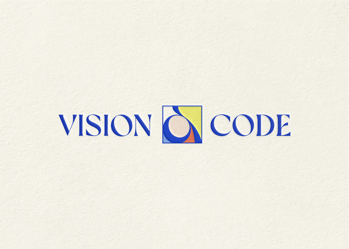
LOGOTYPE EXPLORATION
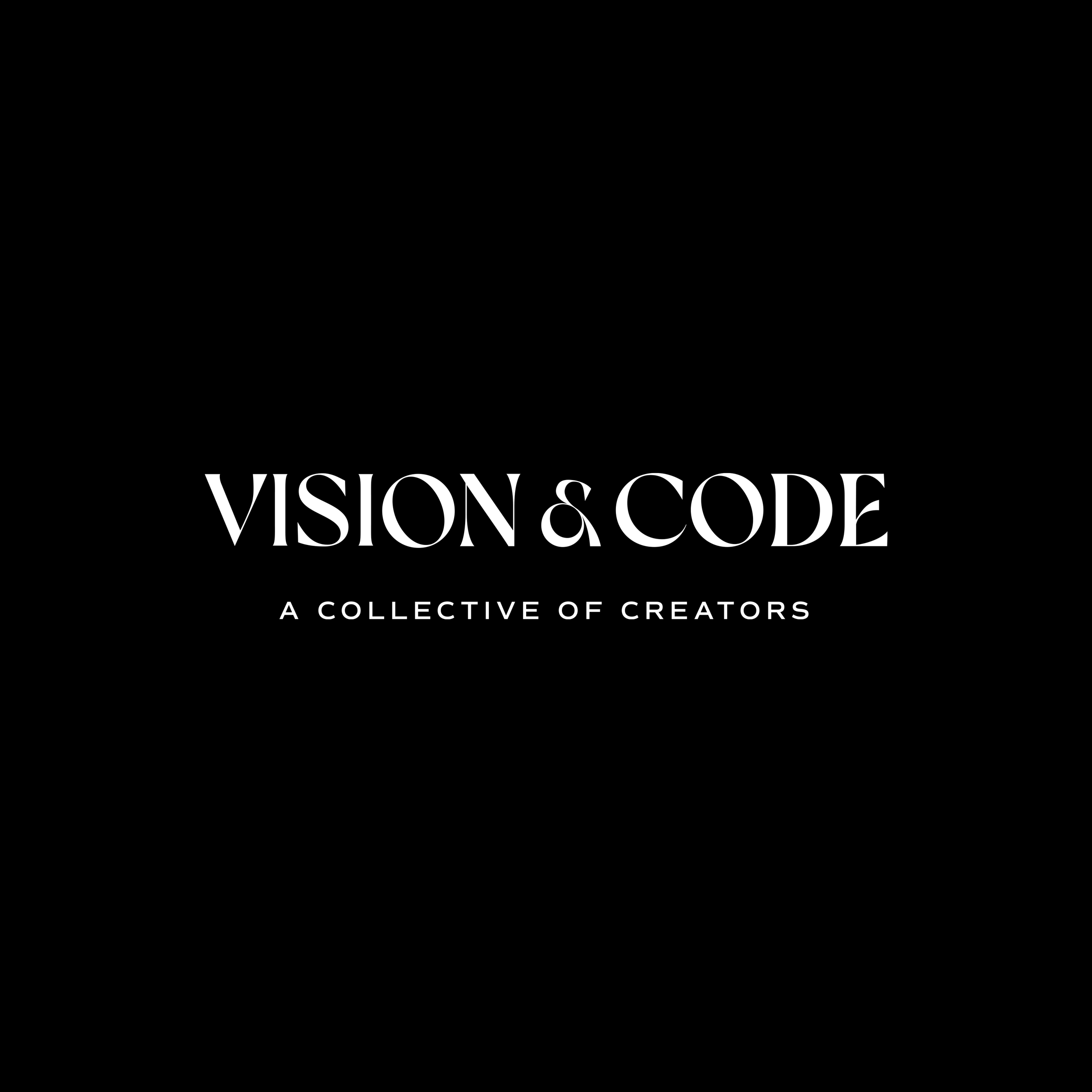
Once the moodboard was established, my next task involved the development of a dynamic and creatively distinctive logotype, aimed at elevating the brand's focus towards a more agency-style identity. The process involved an exploration of numerous options, ultimately culminating in the selection of our final logotype.
Once the moodboard was established, my next task involved the development of a dynamic and creatively distinctive logotype, aimed at elevating the brand's focus towards a more agency-style identity. The process involved an exploration of numerous options, ultimately culminating in the selection of our final logotype.
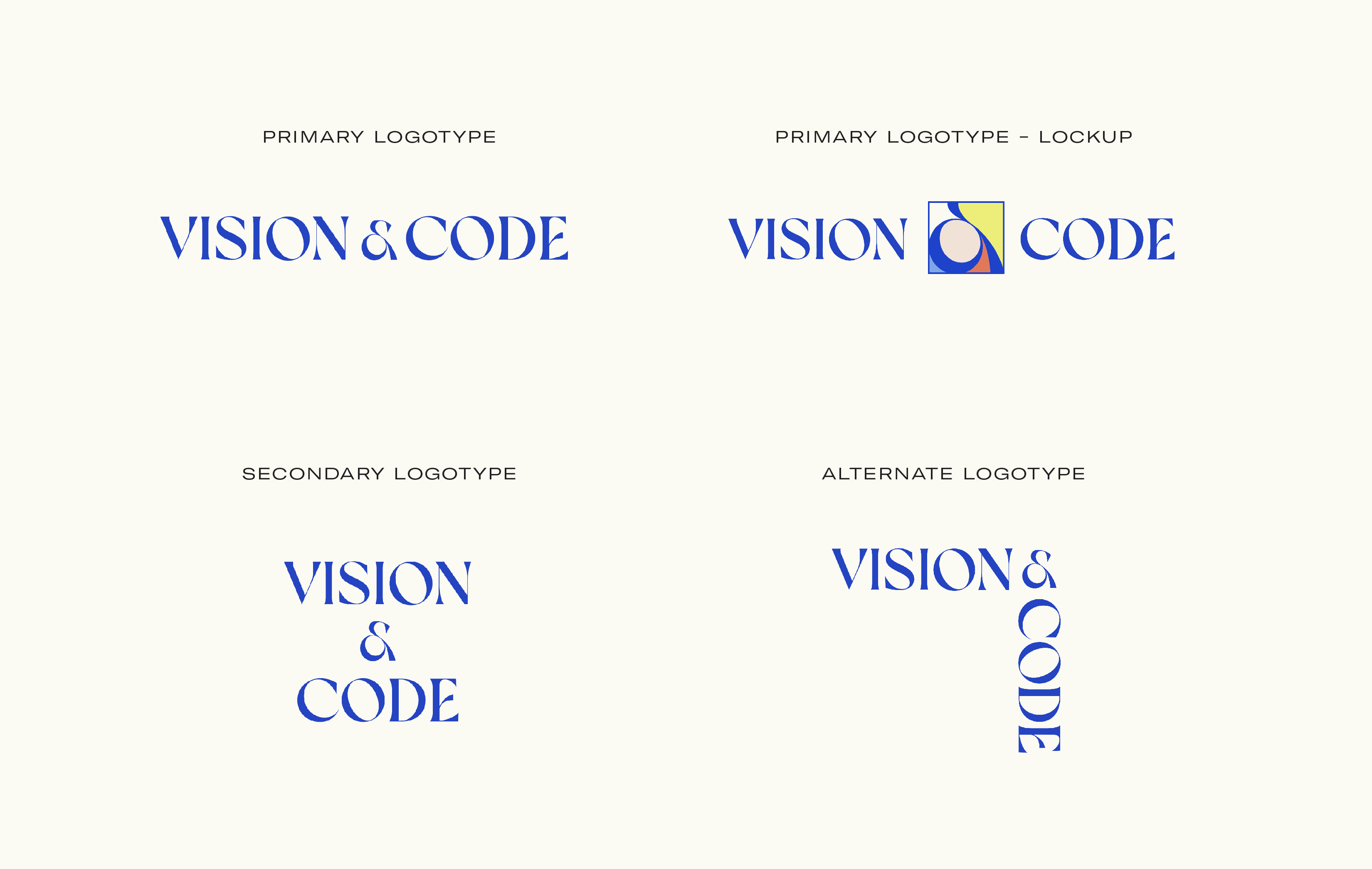
LOGO FAMILY
Following the selection of the final logotype, my efforts were dedicated to the expansion of the brand's identity, encompassing secondary logos, alternate versions, icons, and additional elements. This approach empowers the client with a range of versatile orientations and formats, ensuring a cohesive and adaptable brand that caters to various dimensions and requirements.
Following the selection of the final logotype, my efforts were dedicated to the expansion of the brand's identity, encompassing secondary logos, alternate versions, icons, and additional elements. This approach empowers the client with a range of versatile orientations and formats, ensuring a cohesive and adaptable brand that caters to various dimensions and requirements.
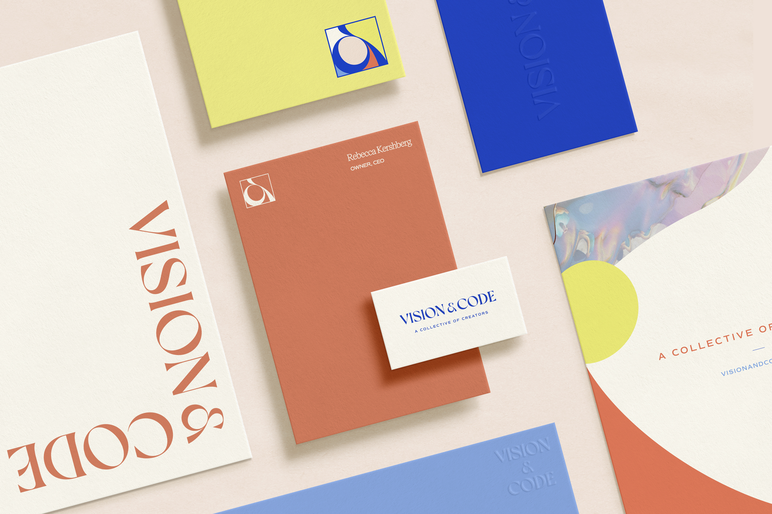
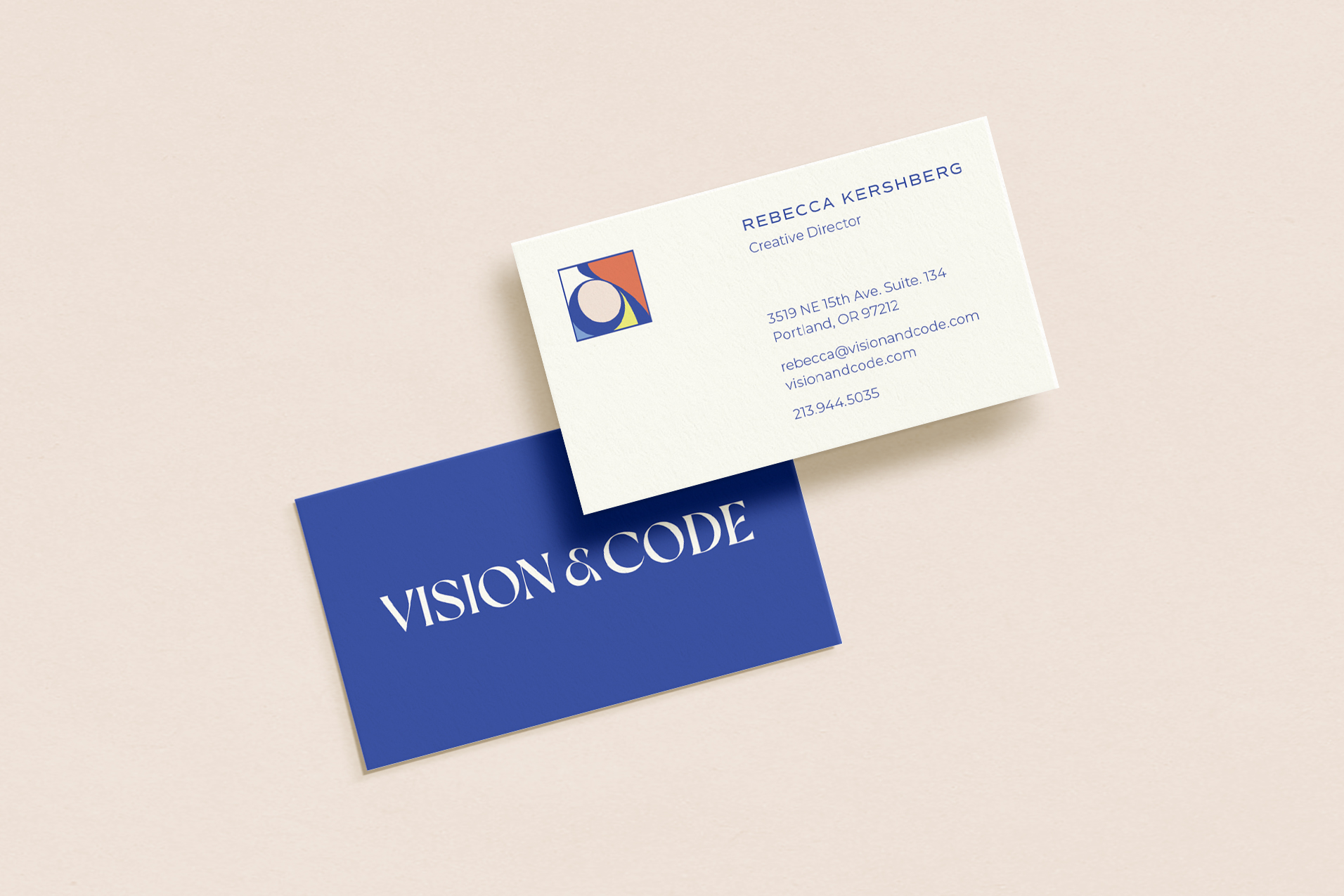
TYPOGRAPHY & COLORS
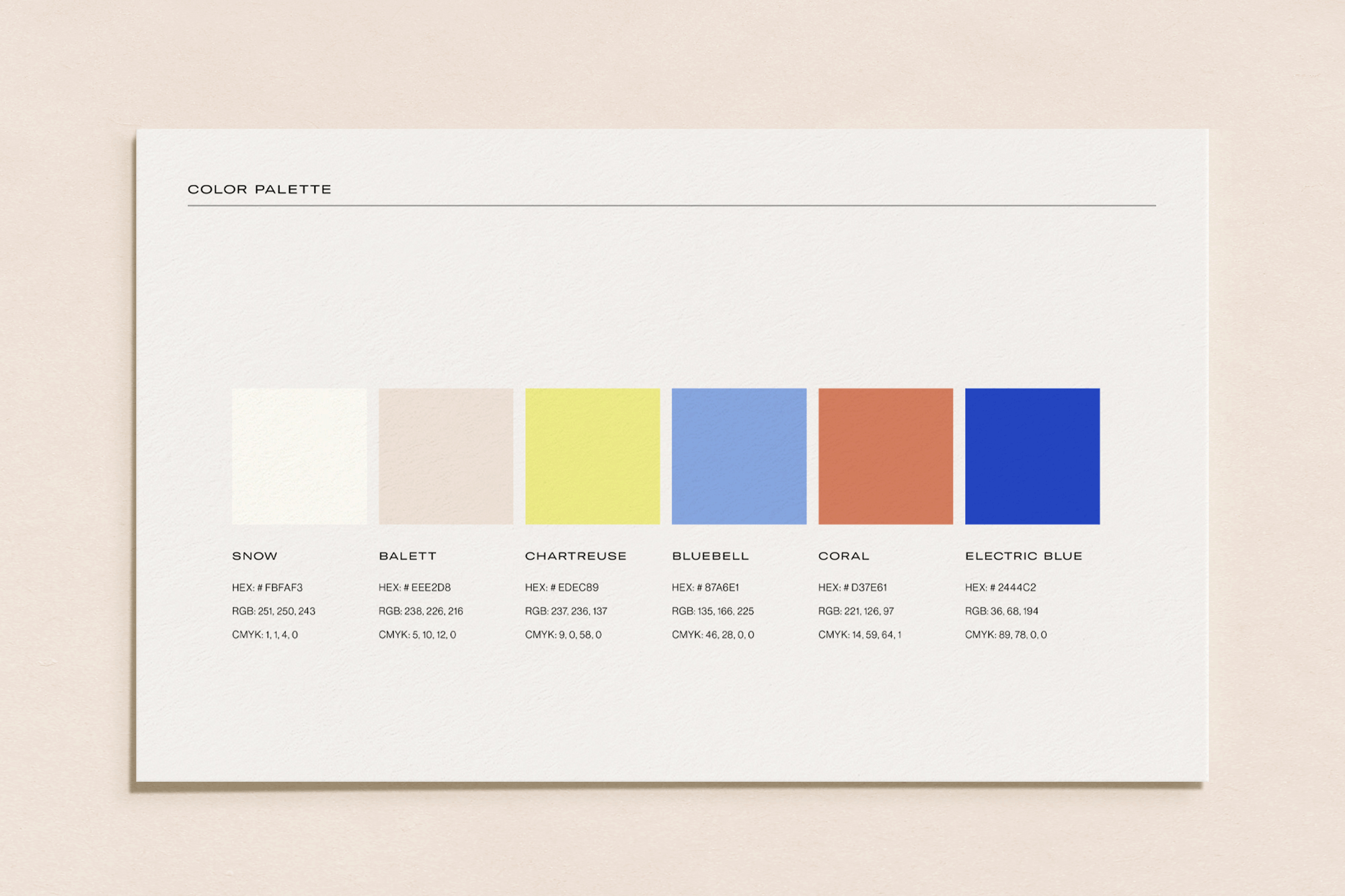
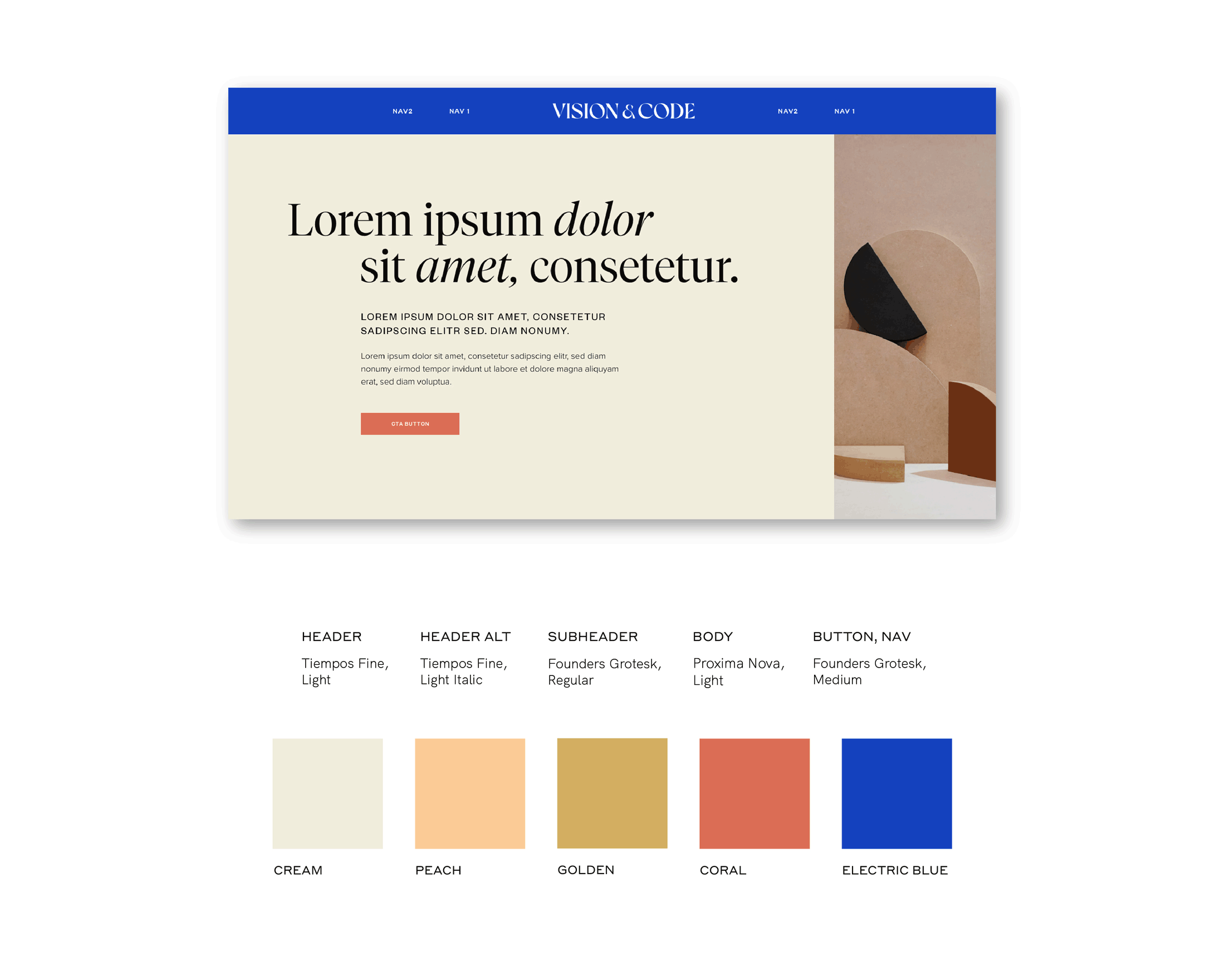
My next phase involved the crafting of a vibrant and imaginative, yet approachable, color palette and typography selection that harmonized seamlessly with the chosen logo family. I explored these choices through a web-styled mockup, offering the client a tangible preview of how these colors and typography would interact in real-life applications.
My next phase involved the crafting of a vibrant and imaginative, yet approachable, color palette and typography selection that harmonized seamlessly with the chosen logo family. I explored these choices through a web-styled mockup, offering the client a tangible preview of how these colors and typography would interact in real-life applications.
The Final Product